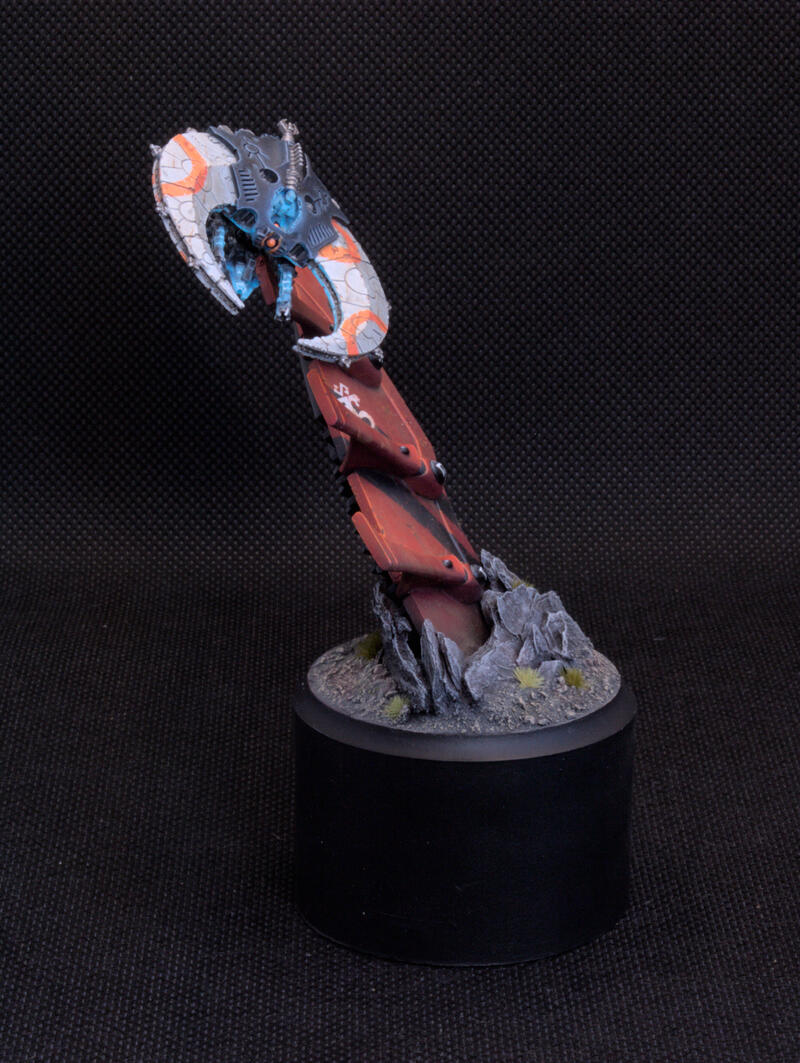
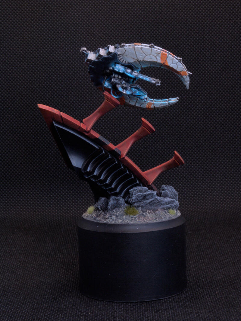
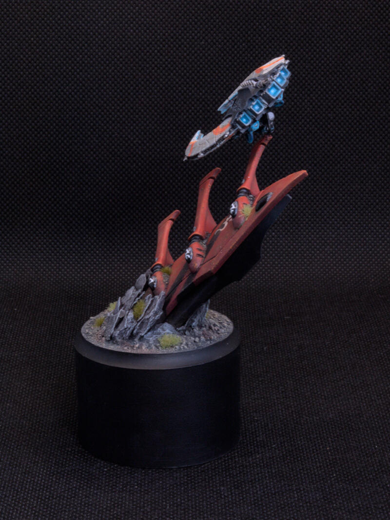
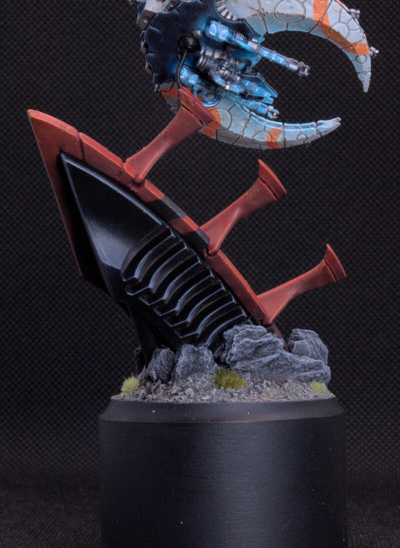
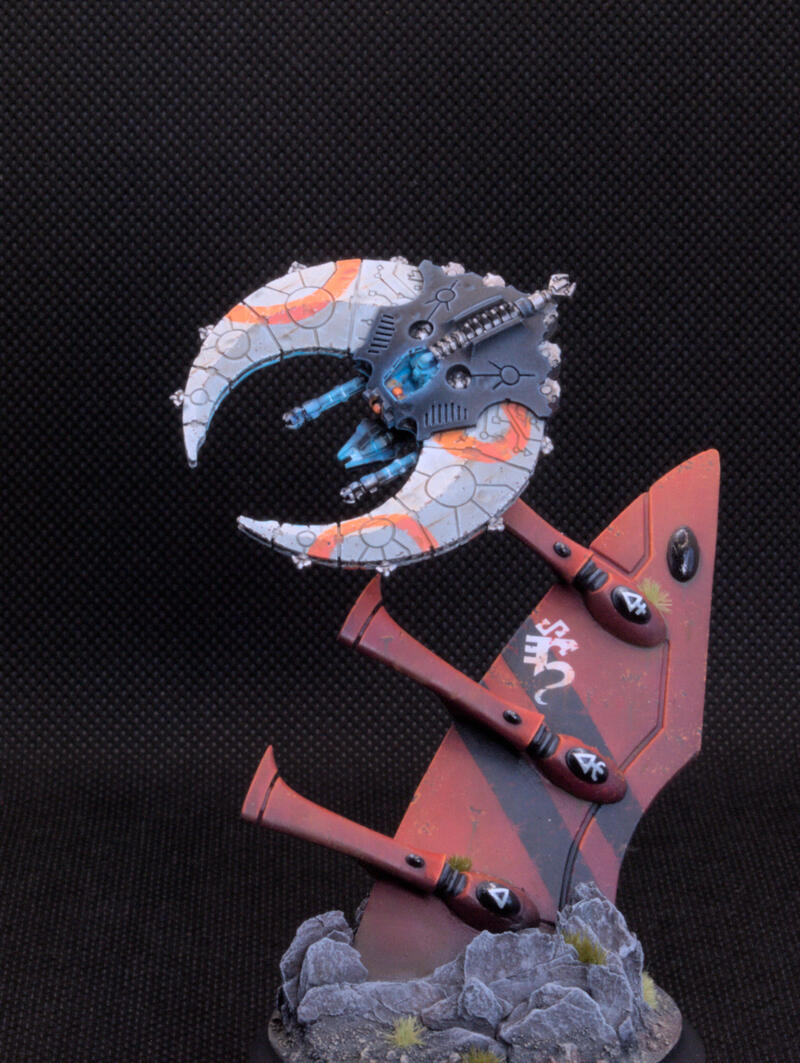
Golden Demon '23 Necron Doom Scythe
20 Jul 2023 - Ollie Jones
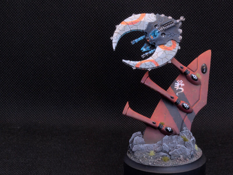
So here we are, my first Golden Demon entry in 10 years, and my first in the main competition. A lot has changed in that time – Large Scale has vanished, Small Scale has been added, and even all the trophies have had a re-design.
I had originally tried to get tickets for the Nottingham event at the end of 2022, but like most people, was unable to. That being said, it ended up working out for the best since I realised I had very little time to actually get an entry together back in 2022. In this article, I am going to go through the process that led me to get the final entry you see above with the concepts for my original ideas and then finally the feedback that I got from some great artists when I was chatting to them at Warhammer Fest.
The Category
I knew I was going to be busy in January, and I also had exams coming up in March, so I wanted to paint something small. I don’t think I’m quite there yet for the single miniature categories but I really enjoy doing weathering on vehicles and armour. The Small Scale category was ideal as I could make a scene that is relatively small and still play around with a lot of technical effects without having to worry about reposing or converting – at the end of the day a vehicle is a vehicle.
The Concept
I hadn’t seen much diversity in the Small Scale category, in particular, I hadn’t seen any Necron flyers entered. I really liked the Doom Scythe anyway as it has plenty of hard edges that make lighting straightforward, as well as plenty of sources that can be used for OSL so I knew that was the mini I wanted to go for.
Something that I also wanted to avoid was a backdrop. Firstly, I saw them on most flying entries as a way to set the scene, but since a lot of the sources of glowing light on the Doom Scythe are from underneath, I didn’t want to hide it with a board behind the model. Secondly, I have never tried to do 2D painting like that before, and I did not have the time to experiment. Instead, I needed to find a way to have the Doom Scythe close to something in order to pin it in a flying position without it seeming forced – I needed a good story.
Now full disclosure, I didn’t end up doing this so feel free to skip ahead a bit, but if you are interested in what I was originally trying to do and my initial experiments, then read on.
I had been floating a lot of ideas on this for a while, some of which shifted around and I may revisit at a later date. I loved the idea of seeing the planes come in to land, so wanted to do the Doom Scythe flying back into the tomb, perhaps through a canyon wall that on one side simply looks like a cave entrance and on the other is this vast open space with some blue lighting coming from deep within. The Doom Scythe could be flying sideways to get through the crack in the wall and thus I could attach it there. Still, that’s potentially obscuring a lot of stuff.
Stalagmites? Yeah, that makes sense – the tomb world has been there for billions of years, near the edges it is likely there will be rock formations which may not have been cleared yet. At one end we have the tomb world at the other there is a transition into a rocky cave. The Doom Scythe can be weaving through, and the stalagmites will provide a great way to cast some more shadows around the cave. Great there we have it, so how do I make it look like a tomb world?
The First Attempt at a Base
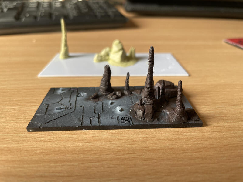
I played around with a lot of ideas but effectively I needed to cut up and tile the floor in geometric shapes, much like the ones we see on Necron vehicles like the Monolith. First I tried rolling out a big sheet of Milliput and tried to see if I could carve and break that up how I wanted. I struggled to get it quite thin enough, and my carving looked far too irregular. While to a certain extent there would be some irregularities, at the Small Scale it wouldn’t be so apparent and so I decided that wasn’t going to work.
Next up I tried cutting up some plasticard. This worked better, and in fact, I realised I could turn some of the offcuts into small crystals that worked quite well. However, it was tricky to get the distance between the tiles sorted such that it was clean but not too large. Nonetheless, I also used this as an opportunity to practice my sculpting and put some rocks and stalagmites on there to see how they would turn out. I had an image of Albert Moreto Font’s Nottingham 2022 entry next to me since I liked how the rocks turned out on that and I had also seen a lot of WIPs on Instagram of it so I tried to recreate some of those shapes. My only concern was the stalagmites were a bit difficult to make sufficiently tall. I knew that I would have a pin through them anyway, but for the scale, I think they may have looked a bit off. Anyway, I knew I could at least sculpt something more if I needed to. So back to sorting the Tomb World floor.
Well, what better way to make something look like it was made by machines than… well… making it with a machine? I jumped on Adobe Illustrator and drew out some designs. This was actually ideal as I could also etch some Necron glyphs into the floors. It was coming to the end of March at this point so I had 1 month to get everything sorted. No fear though, I had a week off work to do exactly that, so my flatmate kindly agreed to laser cut the pieces for me and I could get everything built and start painting straight away.
Slight snag… I got them cut 2/3 the size they should have been and we wouldn’t get a chance to get some new ones cut for another week. So I couldn’t finish the base now and I’d have to make use of my time off differently. It’s fine though – I’ll have plenty of time to come back to this later right? I did use some of the time to at least mock up a smaller scale (of a small scale entry) to check the rocks looked right on the design and get some colours down. I still wasn’t happy with the stalagmites though.
Test Schemes
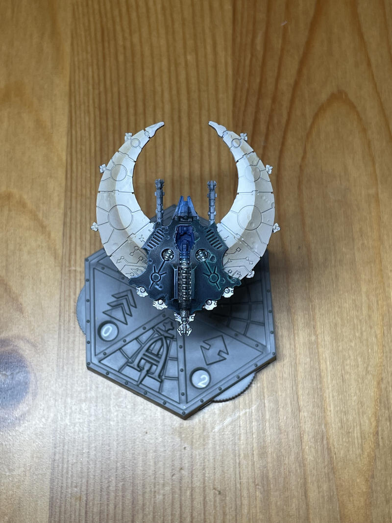
Anyway, so the base was on pause for now, but the mini is of course the most important part of your entry, the base is just the frame for it, so I should get that sorted first. I had been inspired by a lot of Votann colour schemes that use a dirty cream off-white with orange and blue/black spot colours and wanted to try and recreate that. I had also seen Richard Grey’s technique for how he paints his Imperial fists and figured that the stippling scheme would help (a) build up the colours gradually so I get a smooth gradient from fairly dark to bright and (b) help me control where the lighting is coming from.
Fortunately, the Aeronautica Doom Scythe squadron comes with two of the flyers, so I used the one that was slightly damaged (annoyingly it arrived with a small part snapped off) to try out the colours before jumping onto the proper one. Not least because this was a lot of OSL, which I hadn’t had the chance to do on such a large area before. Before painting, I dinged up the hull with a Dremel to make it look like it had taken some dents over the years. I felt this would add a bit more visual interest as well as help me signpost where the light was coming from a bit more since the panels were largely flat.
To a certain extent, the stippling worked. However, it was still a bit too brown so ended up going in with an airbrush to brighten things up a bit. Now it just looked a bit too…. Fleshy… and the orange wouldn’t pop quite how I liked it.
I went through a couple more iterations, including one where I just stripped the whole model and tried to light it entirely from the glow of the weapons underneath which, while cool, did not leave much more to be done to really wow the GD judges.
Finally, I decided to just paint it white with a neutral brown shading. Fab now I can finally start on the entry itself… I have 3 weeks to go.
The mini
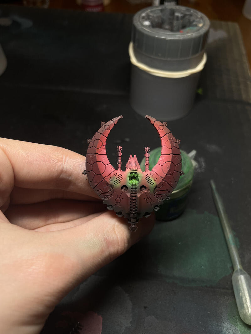
Okay so starting with an airbrush, I primed black and then added a directional lighting of white ink coming from a harsh angle from the side. I then proceeded to airbrush the darker areas Celestra Grey, and the lighter areas Ulthuan Grey.
To add a bit more modulation in tone on the light and dark side, I airbrushed a very thin glaze along the centre of the panels on the dark side Stormvermin Fur, and highlighted the edges of the light side with white ink through the airbrush. Block in the central cockpit area black, and the metallics with Iron Hands steel and great we are off to the races.
Refining the White
Paints used:
- Stormvermin Fur
- Celestra Grey
- Ulthuam Grey
- White Scar
Shade the recesses across the white areas (both light and dark) with pure Stormvermin fur. For the dark side I made a 50:50 mix of Celestra and Stormvermin, pure Celestra and a 50:50 mix of Celestra and Ulthuan, for the light side it was Ulthuan, 50:50 Ulthuan and White, and then White.
Because I intentionally made sure that the airbrush didn’t cover in a single out-of-the-pot colour I had to iterate between the different mixes for each half to highlight it up, I only used the darkest of each (i.e. 50:50 Celstra and Stormvermin for dark side and Ulthuan for light side)in a couple of places just to smooth out some of the transitions. I highlighted all the edges facing the light source and glazed towards those edges to give a smooth transition. I also put lots of small scratches across the hull in all but the lightest colours on each half so that it adds a cool weathered texture without looking explicitly like fresh battle damage.
Black Cockpit
Paints used:
- Abbadon black
- Incubi Darkness
- Dark Reaper
- Thunderhawk Blue
- Russ Grey
- Fenrisian Grey
Flat black is quite a harsh colour and so I wanted to soften that ever so slightly. With an Artis Opus drybrush I stippled some Incubi Darkness across the area, focussing on the edges to add a bit more variation to this panel – make sure to mask off the white areas though to avoid any overbrushing!
I then highlighted starting from Dark Reaper and through Thunderhawk Blue, Russ grey and Fenrisian Grey, again largely focusing edges on the lightest side. I also glazed up some of the Thunderhawk blue on the surfaces that were directly perpendicular to the light. On the further side of the cockpit, I only went up to Russ Grey.
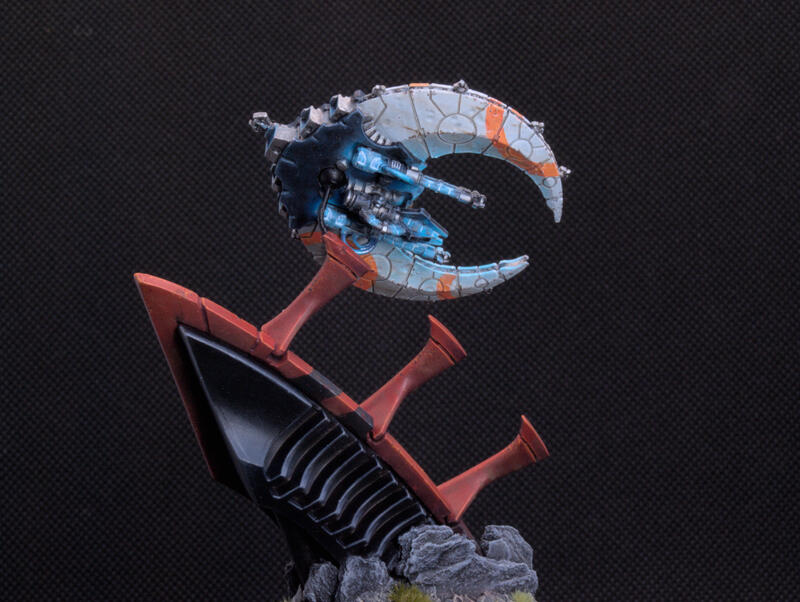
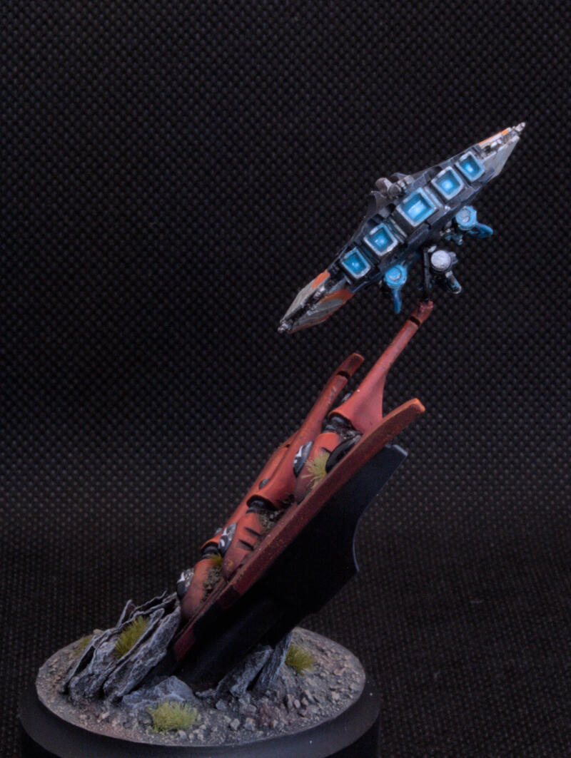
Blue OSL
Paints used:
- Ahriman Blue
- Temple Guard Blue
- Bahroth Blue
Despite the fact I hadn’t finished all the details, it was at this point that for some reason I decided to do the OSL. Which was dumb, but fortunately it worked out. I had watched plenty of videos online but it was Zumikito’s video that finally made it stick. I was mainly concerned about how to make the glow blue but not wash out the fact there was also environmental lighting coming from the side. Turns out since I was already using white anyway, it was just a matter of glazing Bahroth Blue down the hull and the results worked perfectly, it’s actually my favourite bit!
As an aside, when I had originally tried this on my test model I had tried glazing dark blues first. In hindsight, this clearly doesn’t make sense which is why it looks so weird (unfortunately I don’t have many pictures). The reason it doesn’t work, is the weapons are a light source. Regardless of what environmental lighting there is, the weapons shouldn’t make anything darker. Therefore using any colour which has a darker value than that which you are covering will look weird – Bahroth blue has a slightly higher value than Celestra grey and so adds to the lighting which is why it works so well. This is a particular learning point I’m definitely going to take on in future.
Orang Rings
Paints used:
- Wild Rider red
- Troll Slayer orange
- Fire Dragon Bright
- Stormvermin Fur
At the start I mentioned how I wanted orange in there too, so better find a way to put that on! I really liked the Novokh dynasty studio doom scythe which had some of the Necron glyphs over the top in white, and figured some similar freehand would work just as well.
I stuck a load of layers of masking tape together and cut out various-sized circles from it to make a template that I put over the mini. I sprayed from the darker side Wild Rider red and from the lighter side Troll Slayer orange. I then came back in with Wild Rider red to reinforce the darker side, reinforced the recesses again with Stormvermin Fur and then highlighted through Troll Slayer orange, Fire Dragon Bright and Kindle Flame in a similar manner as I did for the white.
Perhaps I was overthinking (which I don’t think is possible for a GB entry) but I chose the specific layout of the circles to form a triangle that was pointing upwards towards the light. I was hoping this would then draw the eye away from the base and focus on what is important, namely the mini!
To weather the orange I then added some chips in Ulthuan and Celestra grey where appropriate to make it look like the paint had been scratched off in places.
I was worried since I had already done some OSL I would have to go back over it, but actually the original OSL was subtle enough where the orange was that it looked fine and didn’t disrupt the visuals.
Metallics
Paints used:
- Iron Hands Steel
- Nuln oil
- Runefang Steel
Relatively straightforward – Iron Hands Steel base, wash nuln oil, highlight Iron Hands Steel and then a bright silver. Since the metallic details were so small there was only really so much that could be done with this and time was ticking away.
The Weapons and the pilot glow
Paints used:
- Ahriman Blue
- Temple Guard Blue
- Bahroth Blue
- White Scar
This was perhaps the trickiest bit, and I’m still not satisfied with the final results. I figured, because the parts were so small there was no chance I was going to be able to use an airbrush to make this look good. So I went in with some white ink over the areas that would hit the light and tried to glaze in Bahroth blue again.
Since this was straight over metallics it seemed a bit abrupt. I tinkered around for ages to see if I could smooth it out but to no avail.
Similarly, on the cockpit, I wanted to really make this a point of focus so wanted blue environmental lighting around the pilot in the middle of the black panel. Since the light was theoretically coming from below I tried to do the same thing but the top surfaces were kept metal. Again it didn’t have the effect I wanted. I got back out the test mini to see whether I could, in fact, airbrush the glow to at least try and tidy it up a bit, and it did actually work better than I thought (though still not perfect).
So in the end I went over all the glowing parts with Ahriman Blue, Temple Guard Blue and Bahroth Blue. I then painted the deepest parts of any of the light sources with white just to make it look particularly hot.
I also put a bit of varnish on the sources to help amplify this.
Finally, I did the orange glowing parts as spot colours using the same paints as the orange rings.
Right so mini finally finished, I just have a week and a half to sort the whole base right?
The Base I went with
The base was on my mind constantly during those last couple of weeks because it was starting to dawn on me that it might be a bit ambitious, and I would need a lot of practice first to get it to turn out how I wanted. I had been thinking about other ideas that I could have some wreckage that it was flying by but was worried about ruining the sense of scale.
Initially, I had considered some of the curved armour parts from some of the Necron vehicle kits – cut up correctly they can be non-descript Necron ruins.
Finally, when I should have been working, I had a eureka moment. Lying in my cupboard for nearly 10 years has been an Eldar Wave Serpent. It had previously been my brother’s when he had briefly done Warhammer and had been given to me when he lost interest. I had been planning to use it for a base on my Necron Tomb Stalker, which has also been sitting unbuilt for nearly 10 years…
Anyway, the front fins on the armour of that were ideal since they could be mounted to look like part of a webway portal. I hacked off the appropriate bits with a saw and stripped them. I also tried to remove as much of the glue as I could but I couldn’t get all of it, so the construction was not as clean as I would have liked. Some of it I was able to just cover up with dirt anyway so not the end of the world.
I stuck it to a plinth and went for a creamy bone colour which ended up turning out horrendously. Fortunately, I had the other fin that I was using to test schemes on, and realised that red looked much better. I was initially hesitant of using too much colour on the base since I did not want it to draw attention from the model itself, but since the red sort of went with the orange, I felt that this worked okay.
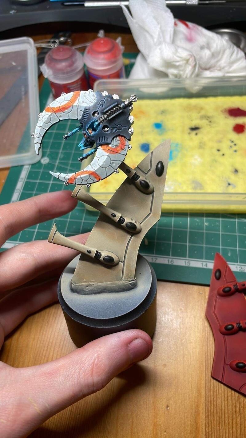
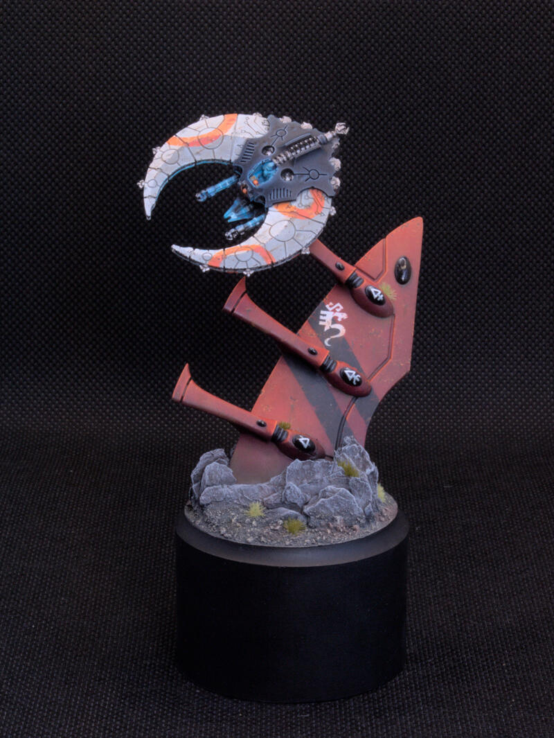
So I stripped the main fin and committed to adding dirt and rocks around it. The rocks were made up of bark and medium slate that I had found in the park. The sizes I found were actually the perfect size to surround the hole base without too much gap filling so it really looks like it bursts out of the ground. The ground is actual dirt, stuck on with PVA glue and then crumbled on top. I made sure to stick the bark and dirt in the oven for an hour to kill anything before sticking it on. I also drilled a hole in the top of the three prongs to later mount the mini.
I’m actually really happy with the composition of the base and think it actually ended up miles better than what I had originally planned. It really is true that sometimes simpler is just better.
Painting the red
Paints used:
- Khorne red
- Mephiston red
- Evil Suns Scarlet
- Wild Rider red
- Troll Slayer orange
- Fire Dragon Bright
- Incubi Darkness
The whole base was primed in black and then a burst of white ink was shot from where the light was coming from so that I could see where the highlights should be. I then came in with the Khorne red in the darker areas and Mephiston red in the lighter areas. I was really worried about making the base too bright and it drawing attention away so I didn’t do too many layers of Khorne red to really keep the colour dull. I then came in along the brightest edges in Evil Suns Scarlett down one side.
Then I started glazing these three colours into their respective areas to start to build up the highlights and shadows. In particular, I came in with scratches of the mid-tones to add a bit of texture. For example, since I had not done a solid coat of any of the colours, going over it with the same colour on a normal brush does slightly highlight the colour. So tiny scratches of Khorne red over the dark areas. I also shaded the recesses with a mix of Incubi Darkness and Khorne red .
I then highlighted through the rest of the colours largely focussing on the edges and getting finer and finer. Fire Dragon Bright was only used as a dot highlight.
A particular thing to bear in mind is that the finish of paints when airbrushed vs normally brushed can be slightly different. Normally an airbrush tends to make things more matte. However, I knew I would be coming over it with varnish later anyway so it would homogenise the look.
Painting the black
Paints used:
- Abaddon black
- Corvus black
- Eshin grey
- Dawnstone
- Administratum grey
- Rhinox Hide
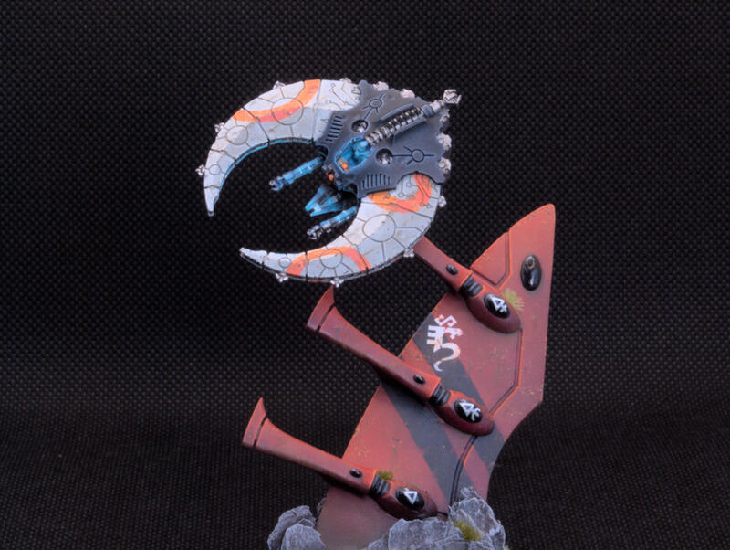
While I liked the red, there wasn’t much visual interest on the fin so I decided to add two black stripes similar to how they are done on Saim-Hann Wave Serpents. I specifically angled these such that they pointed towards where the Doom Scythe would be mounted. I masked off two strips in the red panel and sprayed from Abaddon black to Eshin grey in a similar manner as I did for the red.
On the back, I did some chunky highlights of the same colours and also glazed them into the bits that curved towards the light. I then edge highlighted with Dawnstone and Administratum grey.
In the recesses on the back, I also glazed in some Rhinox Hide to show the build-up of dirt and a bit of weathering.
I also didn’t want to add an additional colour to the base and make it look too busy, so I opted to make the gems black also and highlighted them up in an opaque manner i.e. with the highlights on the top right and no secondary reflection.
The stripes were then chipped with some red scratches to make it look like it was showing the paint underneath, in the same way, that I did with the orange.
After this, I gave it all a blast with gloss varnish to apply some transfer. A particular shout out to my friend Aiden who express shipped them to me with 3 days to go so I could put them on. Finally, I gave everything a coat of Satin varnish to help homogenise the finish and it actually made the reds that bit deeper which was nice.
Rocks
Paints used:
- Rhinox Hide
- Abaddon black
- Dawnstone
- Administratum grey
For the rocks around the base, I base coated them in Rhinox Hide and gave it a thinned-down wash of Abaddon black . Finally, I dry brushed up through Dawnstone and Administratum grey
Dirt
Paints used:
- Skavenblight Dinge
- Stormvermin Fur
- Karak Stone
- Doombull brown
- Castellan green
Airbrushed over the base Skavenblight Dinge. Overspray is fine here since it just shows the dust blowing upwards so I didn’t bother masking any of the other parts. Nex a dry brush of Stormvermin Fur and Karak Stone. Finally, I applied patches of thinned-down Doombull Brown and Castellan Green in patches to modulate the colour.
Weathering
Paints used
- Highlight colour of the respective area
- Dryad Bark
- Castellan Green
- Abteilung 502 Dark Rust
- Abteilung 502 Burnt Umber
2 days to go. Everything is in a position where I could hand it in as it stood but I knew I could make it more visually interesting. Particularly on white, chipping makes it easier to see the edges. I came in with a small bit of sponge and the highlight colour (white for the Doom Scythe, Wilde Rider red for the fin) and dabbed paint over the edges for the initial chipping. I come in with the highlight colour first as it is easier to correct mistakes that you don’t like than if you came straight in with the chipping colour. These highlights then became a guide to fill in with Dryad Bark – simply come in with a fine detail brush and fill in the blobs of the highlight paint.
On the fin, fine drips of castellan green were put around the patches of dirt and from some of the chips.
Tiny dots of the two Abteilung oil paints were also put all over the fin and rubbed in with a soft brush for just a very gentle colour modulation and to matte the fin back down. Finally, on both the Doom Scythe and the fin, small dots of burnt umber would be put all over and then drawn down using some white spirit into very fine drips. Because of the scale, I wanted these to be as thin as possible and fortunately, the beauty of oil paints is that if you mess up it can be removed almost instantly with no long-term effect.
And then… it was go-time.
Golden Demon & Feedback
In the end, I walked away with a Finalist’s pin. Of course, there was a bit of disappointment that I didn’t get further, but also as soon as I saw the other entrants it was clear quite how impressive the field was, and so I certainly wasn’t made to lose out to such excellent talent. After I collected my mini on the final day of Warhammer Fest, I just took the chance to ask people for feedback on what they thought.
As I just happened to be walked past the cabinet I bumped into the King of Small Scale – James Taro. I had to tell him how impressed I was that he got an entry together in 4 days and we naturally moved on to the topic of GD entries. Generally, he was very complimentary about the piece which was very lovely of him, and whether or not it was politeness it was quite nice the number of people who had seemed to note it when it was in the cabinets and mentioned how they liked it while I was walking around. Here are the main points James mentioned:
- More detail on the pilot
I agree with this point a lot. It was something that I needed to try and refine but I didn’t have the time to make mistakes coming towards the end.
- Tidy up the mounting point (part 1)
As you can see from the images above, I am still using the ball joint in the socket of the doom scythe. James suggested to try and hide this more such that you can’t see the pin. I had originally considered drilling a hole in the left wing and having that in contact with the top prong but I was lazy here. It’s definitely true that the entries which immerse themselves in a scene like mine are often positioned very well such that you can’t see how it’s attached.
- Highlight the dents a bit more
Particularly the most distant edge with the brightest colour to help make them pop. Some of the dents did look a little bit flat bar the small amount of shading I had done on the closest edge, and I could definitely have made them look a bit deeper.
- Do something more with the back of the base
James suggested perhaps a small scene at the back like a soldier or body or something. At the very least there were large areas of black on the back of the fin that, while painted, weren’t visually interesting.
Mamikon Khatchikian also very kindly took a look, and since I had experience from his painting classes before I was also interested to show him what I had done since. I also liked to think I helped to take his mind off his incredible duel that was being judged at the time!
- Tidy up the mounting point (part 2)
Specifically, you can see some of the glue where I had painted over it and it would have been straightforward to scrape some of this up and clean that up a bit. I was probably a bit scared that it might look a bit inconsistent if I tried to repaint it but it’s definitely true that every detail needs to be immaculate to be in with a chance.
- Add more weathering to the black areas of the Doom Scythe
I had weathered the white, but aside from the dents, there wasn’t really anything on the black of the Doom Scythe. I probably could have come in with at least some of the browns to make it look like it was gathering in the recesses more.
During the Cult of Paint meet up Andy Wardle also very kindly cast his eye over it. The entire Cult of Paint team were generally really lovely and there were quite a few people sharing their pieces with one another. It was a great atmosphere. So Andy mentioned:
- Push the highlights/shadows more
While you could see that I had put some directional lighting on the Doom Scythe, the darker side could be darker so that it reads more clearly in many different environments, rather than just accentuating the golden angle. Similarly, he noted that he could see that I had tried to lighten where the black curved up slightly, but I could go further with this. I expressed reservations since I didn’t want it to look too blue, which he agreed with but mentioned how he typically highlights up past where he wants it then knocks the colour back with the base in order to make sure it reads correctly, which is certainly sound advice I will try in the future.
Certainly looking at the test model I realised that I had actually pushed the darker side of the white parts a lot more, and just hadn’t committed as much in the final thing. One thing I should probably do in future is take black and white photos of the miniature to see how much contrast there actually is in terms of colour but also light value.
- Lighting on the dirt/rocks
Simply put, there was no real indication of where the light was coming from on the rocks and base so this could have been made more obvious. In particular, he suggested in future using something like Milliput and carving some sharp edges so that there are clear surfaces that are in light and shadow. I did really like the texture of the bark and the rocks, so I’m not sure if I would sculpt the rocks for a Small Scale entry, but from my experience of doing the lighting on purity seals which have lots of folds, it certainly does let you have a really stark lighting if there are sharp edges. Perhaps I could have made them more like Necron crystals if I had tried that again.
- More detail on the pilot
The pilot was largely just the brightest blue colour I had used and it needed more variation. In particular, Andy suggested that I start from the darkest base and highlight from underneath a bit more It might not have looked as bright overall but would have had more definition and would have been less washed out so should have still caught the eye.
- Add the orange freehand to the black panels too
I think this was more personal taste, and it probably would help tie the two sections of the Doom Scythe together.
Andy also complimented the lack of backdrop, which was very vindicating.
I’m really thankful to James, Mamikon and Andy for their thoughts. Initially, I was a bit anxious approaching people to ask for their thoughts since I didn’t want to bother anyone, but it was really lovely to see how many people were willing to spare their time to talk to people.
Final Thoughts
Four and a half seasons of Star Trek: The Next Generation later (what I was watching while just painting the model) I’m over the moon with the final result. While I may not have gone home with a trophy I got so much out of this whole experience. I’ve learnt so much about OSL and adding visual interest without having to convert everything. I hypnotise myself every time I look at it at the moment because it is by far the best piece I have ever made, and no one else gets to take this beauty home with them and own it forever.
We are of course our own worst critic. The fact that the bit of Wave Serpent was built over 10 years ago and not to the best quality meant that there were some clear marks on the model from where glue had been scratched away, or had built up in other areas. All that being said I am really happy with the paint scheme itself and, while completely different from my original concept, I think turned out far better than I could have imagined.
All the feedback I got above I completely agree with. What’s reassuring is that most of it isn’t necessarily to do something differently but just to do it more i.e. more shadows, more highlights, more detail and range, which means that maybe with a bit more time I could go further with it. It was also good to see that the feedback was consistent which tells me that more time on those areas really would pay dividends.
I really like the concept of the model. It’s likely I won’t enter this same piece again, largely because of the construction issues that you can see on the base, but in the future, I may revisit the composition and try again. At least on my second attempt, I will have a good reference of what I am aiming for which means that I don’t need to experiment as much.
If you have made it this far, then thanks for reading all the way through. I would also love your feedback on the model too so please drop a comment below, or on my socials, or even DM if you have any questions and would like to chat about it further.
I’m now going to take a well-earned break for a bit. But I’m tempted to do something more with my Scrap Demon entry now…